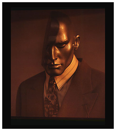
“There used to be a thing in “professional portrait” composition that suggested you need to make portraits that face the viewer as one walks through the gallery space. It acted as a greeting as it mimicked the concept of meeting people in a lineup. Right-hand handshakes might be the reason. But I believe that rules of any kind can be broken and therefore, I would want to do the opposite.”
Images that follow the silly convention of facing the viewer restrict the possibility of creative presentation.
Just as foolish is the behavior of looking at works of art by randomly strolling through a gallery exhibition.
The idea of moving through a gallery sequentially is usually important to understanding the work.
The reason it is important has to do with sequencing. While many so-called galleries ignore the concept, it is a good idea to assume that the work has some sort of progression.
As in a book, and if the photographer’s work has been carefully hung, the images can unfold a pattern that makes sense of the works shown.
A good gallery presentation shows the works of an artist as a progression. Not a progression of when the images were made. But rather a progression of what the images may reveal to the viewer.
I was taught that images produced within a body of work need to be sequenced so that the concept can be revealed to the reader/viewer as the sequence evolves.
In that sense, it makes more sense to think of sequencing and compositional concerns as a path towards an understanding of what the sequence might be about. How an image greets you within the progression should have more to do with the transition from frame to frame or rather, from image to image. A great presentation has a beginning and an ending.
The need to follow old conventions are not as important as guiding the viewer towards a new revelation. Basically, the intent is to present the work in a way that leads to the underlying significance of the entire project.
In the modern concept of photography, older conventions are things one should possibly consider, but they are also things to question.
When presenting images as a body of work, it is best to ask the questions – What are you trying to show?…How does it work as a statement? … How do the images support the concept? …How does it work as a sequence or as a series? …How might the presentation stimulate thought in the viewer?
Read about my book – Focus In Photography
NOTICE of Copyright: THIS POSTING AS WELL AS ALL PHOTOGRAPHS, GALLERY IMAGES, AND ILLUSTRATIONS ARE COPYRIGHT © JOHN NEEL AND ARE NOT TO BE USED FOR ANY PURPOSE WITHOUT WRITTEN CONSENT FROM THE WRITER, THE PHOTOGRAPHER AND/OR lensgarden.com. THE IDEAS EXPRESSED ARE THE PROPERTY OF THE PHOTOGRAPHER AND THE AUTHOR.
This NOTICE of Copyright applies to all content posted on this blog – www.lensgarden.com.


